Breaking out of the box: a rebrand for Het Raster
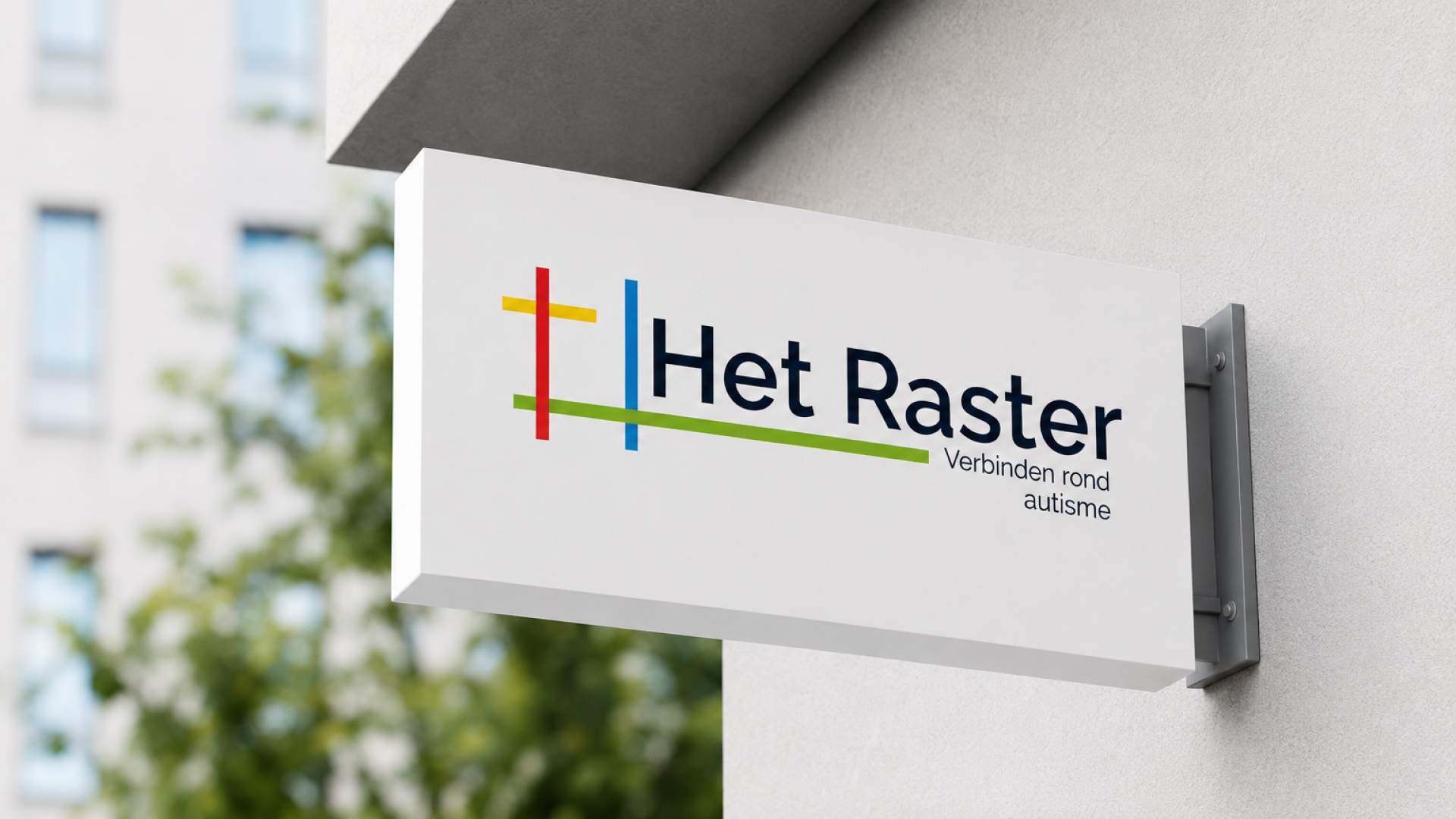
Het Raster has supported people with autism and the people around them for 25 years. For that anniversary, they wanted one thing: a fresh logo, because the old one had gone stale and faded. We delivered that. But we immediately saw a bigger opportunity: it wasn't just about colours, it was about what Het Raster actually stands for.

The challenge
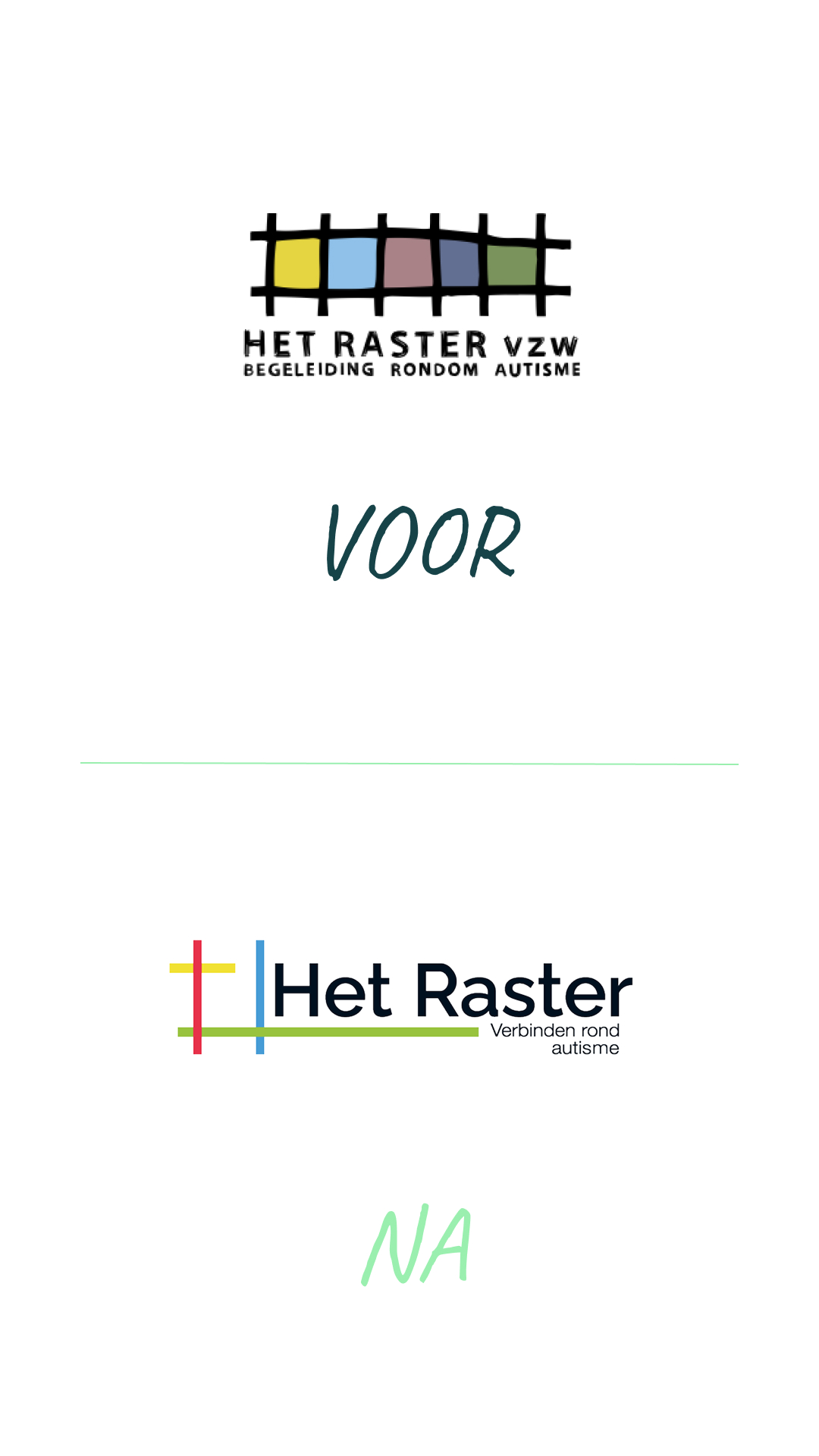
The old logo lacked strength. The colours were washed out, the structure was locked into dense boxes: a grid of little squares. It could be fresher, more alive, and above all more consistent.
Something else was at play beneath the surface. The tagline "Support for autism" mainly said what Het Raster does. And everyone already knew that. The question nobody asked: does this brand actually say what Het Raster truly stands for?
The analysis
We started with the brief, but didn't stop there. Refreshing a logo is easy. Making a brand reflect who you are, that's the real work. So we followed the logic of the name itself.
That’s when everything fell into place. Het Raster isn't named like that by accident: a raster is a grid of boxes. Here's where the empathy came in: the people they support refuse to be put in a box. The shape was telling the opposite story.
No one wants to be labeled. So we broke out of the grid.
The approach
We developed several graphic design concepts, each based on a single clear principle. The strongest one won: opening up the dense grid completely. The lines still cross and touch, but now they connect instead of locking anyone into a box.
At the same time, the tagline shifted from what they do to what they stand for: from "support for autism" to "connecting around autism". Brighter colours, a more open feel, and a logo that remains recognisable as Het Raster. The latter stems from authenticity: a brand that erases its own past just doesn’t make sense anymore.
And because a logo on its own will only cause problems down the road, we created a brand board: colours, typography and style elements as a solid framework for everything Het Raster creates next, from letterhead to social media.
Logic in the analysis, empathy for the people Het Raster supports every day, and a brand that honestly shows who they are. Exactly the building blocks Het Raster itself runs on: connection and trust.
Aspect ratio: 7/3
.png)
Aspect ratio: 6/5
Aspect ratio: 7/3
The result
Het Raster celebrated its 25th anniversary with more than a new logo. It got a brand identity that feels right: still recognisable, yet more open. A visual language that no longer just tells people what they do, but lets them feel what they stand for: connection.
Plenty of people with strong opinions sat around the table. Understandable, for an organisation that matters. By truly listening, and still holding on to our vision, one clear direction emerged quickly. The client summed it up like this:
